BD Rowa - Website Relaunch
The future of Pharmacy
Rowa produces and sells automated warehouses for pharmacies. These systems are manufactured individually for each pharmacy or hospital and store the medicine boxes chaotically according to size and height classes as in a high-bay warehouse. Rowa divides its product line between 4 target Groups. Pharmacies, Hospitals, whole Sales, and Packaging centers. Due to their individuality and the different usages, the product Website should only Display the relevant Content for each target group and guide them through a specific journey.
My Role:
As the leading product designer, I was in charge of the Research which consisted in competitor Analysis, customer interviews and a design thinking Workshop with the Rowa Stakeholders. In the creation Phase I created a new Sitemap, customer journeys and provided wireframes for all the different modules for the Website, including a clickable prototype to test the new product configurator.
*To comply with my non-disclosure agreement, I have omitted and obfuscated confidential information in this case study. All information in this case study is my own and does not necessarily reflect the views of BD Rowa.

Problem Statement
After acknowledging that there were four different target audiences, we quickly discovered that the current website pushed ALL users into the same journey (Pharmacist). After inspecting the analytics data we saw that the users did not bother to change the audience type, and because of this many users were probably missing relevant information.

When visiting the BD Rowa Website, all users are pushed into the Pharmacist Journey, getting only relevant Information for Pharmacists.Users seem to oversee this button or think that Rowa is only for Pharmacies.
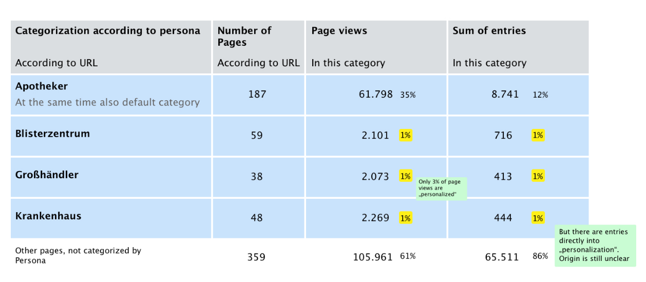
Traffic Analytics
The metrics clearly Show that only 3% of all visits are "personalized". It also is shown that the journeys on the Website did not guide the users correctly and that many entries into a category where not Happening through the Main site. We thought that this must happen through the Rowa Content hub (Blog Articles) which is linked to Sites that were outside the original Sitemap structure.
Design Thinking Workshop
I prepared a Design thinking Workshop with the Stakeholder team from BD Rowa and printed out all the problems that we found by analyzing the Website and the provided data. The goal of this workshop was to have the whole team on the same site, create as many ideas as possible, and to resolve the main structure of the Website.We used exercises like Stakeholder maps, how might we? and Card sorting. The result was a list of to do´s and a first kickoff to start the "ideation and decision" phase.

How might we...
We converted all the issues that we found on our analysis to user stories, and then printed them out, stuck them on the wall, and tackled them one by one with the whole team. We used a timeboxed frame for this allowing the team to take 2 minutes to write solutions for all the problems and possible issues that might stop us from improving a certain problem.


Stakeholder Map
The scope of the Stakeholder map was to understand and improve the customer experience of the website. We created a list of all the stakeholders that were involved in the customer experience and would influence on changes being made. Then we clustered the stakeholders in "Internal Stakeholders" (being the most important) "direct stakeholders" and "indirect stakeholders" and positioned them inside the specific product group.


Information structure through Card sorting
I gave the group the task to write on post-its individual information elements that the website should provide, e.g. product configurator, customer attention phone number, or product comparison sheet. after sticking all the post-its to the whiteboard we proceeded to group them into categories. In this way, we all voted where specific information should be allocated within the website. I did then start creating modules for each site and had enough information to create the new Sitemap.
Synthesis and Learnings
Adapt relevant content on the homepage to match user story
> Emotional address (showing the equipment in context with the user, use & usage)
> Show the end product of the plants
> Integrate references prominently into the User Journey.
> Work out infographics in more detail
> Adapt comparison module
> Wording: Space available, Up to 65% more space
> Name models in the picture by name
> Adaptation of the use-case of the module "Which Rowa suits you?"
> Focus more on additional services (seminars, training & education)
Optimize user experience on the website
> Simplify newsletter registration
> Avoid additional clicks (e.g. in the configurator)
> Visible contact/service module for quick access to the hotline
Optimize user experience on the website
> e.g. provision of whitepapers and studies as download with e-mail query
New creation of relevant contentfor target audience
> View into the vending machine / glass vending machine / functional principle.
> Competitive comparison.
> Contact person introduction/consultant team
> Service-Success-Stories ("So fast was the spare part there")
> Amortisation-Case/Story ("With a usage of 4 years, you can expect 170.000 € more turnover) incl. amortisation calculator (module)
> Show the advantages of the software
User Journeys
Based on what we´ve learned we created some user journeys to deeply understand how potential customers will access and navigate the website. Since Rowa had planned to publish more content on their content Hub we also wanted to show how users would access the Website through the Hub. Having these user journeys we could start improving the Sitemap of the Website.

Sitemap adaptation towards topic relevancy
After checking with the Stakeholders we all agreed on the topic relevancy. The website journey should not be based on the client type (unrelated) The website should offer a clear visual choice. Products should be attached to a selling campaign and the main topic should be focused on the product itself, the Robots.


Ideation & Creation
As we got the new Sitemap approved by the Client we jumped straight into creating wireframes that would help to understand how the Website will work, and how the Content is distributed on the pages. We worked on the Modules using Atomic Design principles and created all modules for mobile and desktop. Through Invision we constantly had the client involved in the Agile process being able to give quick feedback while we were designing the individual Modules.
Improved Navigation
The new navigation offers the essentials of brand introduction and product selection. Industry selection does not affect the main journey anymore.


Improving the Product Configurator
The main topic was highlighting the products and helping customers find the perfect robot that would suit their needs and available space. The old configurator was highly criticized by many clients, but in the customer interviews and analytics as well, we saw that the configurator is an important feature that many customers would like, but it needed to provide value. For our initial approach of redesigning the configurator we wanted to decrease as much friction as possible, the customer should be able to play around without having to load a new page.The possible configurations determine by space, packaging number, and Add-ons.
Responsive Modules
Our mission also consisted of having all modules on the website responsive. for each module, we prepared a mobile version and included the stakeholders through "Invision app" in the agile process. in this form they could directly comment on the modules and suggest changes or reviews.We designed all modules based on the information we had from the "Card sorting" exercise and from the Information Architecture, we used a storytelling approach for the positioning on the relative sites.


Full page Wireframes
To see all the full page wireframes please click the link below. (Invision Web)
Interface Design (Development Stage)
I will be publishing the final design once it´s finished and approved. Stay tuned!