RaboBank - Banking App
The modern way of Banking.
Rabo Bank is a well established Bank in the Netherlands with over 9.5 Million clients using their App. Rabo Bank Germany wanted to create a complete new app targeting the German and Belgian market. It should also be equipped with modern features to capture the attention of a bigger audience and compete with the many modern banking unicorns. The product itself should be focused on saving money and give the users detailed information about their savings, of course without missing an easy and fast way of wiring money to all kinds of accounts.
My Role:
As the Head of UX and Product Design I was in charge of the Research, Stakeholder Interviews, Client briefings, Ideation & Creation, Feature definition and user testing.
*To comply with my non-disclosure agreement, I have omitted and obfuscated confidential information in this case study. All information in this case study is my own and does not necessarily reflect the views of Rabo Bank.

Problem Statement
Most banking products of larger banks are limited to the transfer of money and are missing more features to be innovative. When customers want to invest money, it is usually transferred to a savings account. However, the wiring to such accounts requires a visit or a phone call to the bank. How can you make new customers aware of the product and motivate them to change?

Our Goals for the App
- How can we create value for our customers?
- How can we generate a high frequency usage of the app?
These are the main goals we want to achieve with the app. Therefore we identified 5 qualities that we needed to address in order to create a product that can answer those 2 questions. Beginning with the main needs of potential customers, offering a smart way of saving money, being able to compete with the other products, in the process identify new opportunities and overall listening and building a better relation to the customers.
Discovery & co-creation phase
• User needs based on persona development
• Benchmarking to collect features and find the unique selling proposition for release 1 and how we market them.
• Kano-Analysis to define features from user perspective and define the roadmap, especially which will implemented first.
• Feasibility-check of features for the first release, especially by native app development.
• Rough concept of a target picture and the derived first release

Design thinking Workshop
Persona Development
We analyzed the different needs through qualitative research where we had 15 in-depth interviews with banking customers that used different banking products. With the insights, we created 4 segments based on different criteria points, four interview partners per segment. Having these 2 main Personae we created 4 scenario personae that represented a different life path. The Investor, the long term saver, the young and hip entrepreneur, and the typical family father. We then created a high fidelity persona to be able to use it for customer journey analysis and different scenarios when creating the product.


Competitor Analysis
A competitive analysis revealed the strengths, weaknesses, similarities, and differences between competitors in the banking segment. We analyzed typical banking products but had a deeper look into new and hip banking products.


Kano Analysis based on competitors
With the Kano analysis, we got some insight into the product attributes which are perceived to be important to customers. we divided them into the Basic needs that are important to all users. Performance needs that the app should have in order to compete with the other products and the Delighters which will make the app stick out of the rest.
Basic Needs
> Virtual cards (Apple Pay, Google Pay)
> Contactless paying with app
> Withdrawls at any ATM
> Push notifications on all transactions
> Photo Tan
> Money transfers
> Account statistics with infographics
> Individual wallets for saving and paying
> Fingerprint sensor or face-ID for transfers and logins
> Phone widgets
Performance Needs
> Fitbit Pay, Garmin Pay, Cash link
> Open dispo-credit
> Save receipts / Scan invoices in-app
> Paying with QR-Codes
> Free payment in any currency
> Control insurance contracts
> Free of fees for foreign currencies (master & maestro)
< Cheaper international payments (partnership with TransferWise)
> Shared accounts
> Service chat included
Delighters
> Personal pay-link
> Automatic savings-function
> Send/receive money via message or mail
> Buy funds and shares
> Compatible with Google Assistant/Smart speaker
> Transfers up to 25€ without TAN
> Saving goals
> Transfer money with Siri and recurring payments
> Chatbot for guidance
Concept Wireframes
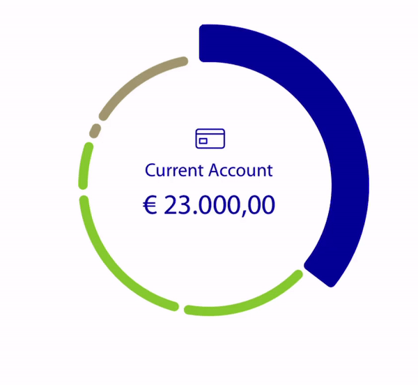
One important aspect that came up while we had our in-depth interviews was that the users wanted to have their total balance very present. One of the main reasons why the users open the app is to check their balance.
When the user has more than one savings account, they want to be able to easily switch from account to account, but having a holistic view of the whole. We tried some different pie charts to display organically the amount split between the accounts, and this one seemed the best match. It can be used by tapping on the chart as by swiping left an right. Also, we made it very easy to open a new account within seconds.


Transaction Process
Being this the most used feature by the users we had to simplify the process. Also we had some reglamentations to follow for the Belgian market. But over all we managed to hide the complicated processing structure that happens in the backend.
Interface Design
Once the core functionalities were defined, we thought about how to design the interface so that the user could differentiate between the elements in it, e.g. we gave the users the possibility to add pictures to their savings accounts. That's an additional motivator to help achieve the savings goal. For the color palette, we have followed the Rabobank branding. Also, we have created an individual icon collection for the product.


User Testing and Eyetracking analysis
Throughout the whole design process, we have been working agile, which means that at certain stages of product development we have prepared some scenarios for testing, tested them with real users, and made the necessary adjustments to the design. Key screens have been tested with eye-tracking software to see if the most important areas get the attention they need.


What did we learn?
This project has given me a very deep insight into the saving behavior of various personalities. My personal key take away in this project is that no matter how technically affine the users are, nobody wants to learn anything new. The app has to follow the navigation structures the user is already used to, and invisibly take the user by the hand for more complex things. The aha! Moments are those in which a user wants to do something common, such as a bank transfer, and this process is then simplified. Like using Photo Iban, or already saved recipients.